Floats, absolutely positioned elements, block containers (such as inline-blocks, table-cells, and table-captions) that are not block boxes, and block boxes with ‘overflow’ other than ‘visible’ (except when that value has been propagated to the viewport) establish new block formatting contexts for their contents.
In a block formatting context, boxes are laid out one after the other, vertically, beginning at the top of a containing block. The vertical distance between two sibling boxes is determined by the ‘margin’ properties. Vertical margins between adjacent block-level boxes in a block formatting context collapse.
In a block formatting context, each box’s left outer edge touches the left edge of the containing block (for right-to-left formatting, right edges touch). This is true even in the presence of floats (although a box’s line boxes may shrink due to the floats), unless the box establishes a new block formatting context (in which case the box itself may become narrower due to the floats).
上面这段话是W3C官方在CSS2.1规范里对“块级格式化上下文”(BFC, Block formmating contexts)的定义。渣翻译如下:
有一些元素会为它的内容建立一个新的块级格式化上下文。这些元素包括:浮动元素,绝对定位的元素,非块级元素(比如
inline-blocks,table-cells, 和table-captions等),overflow属性值只要不是visible的块级元素。在一个BFC中,盒子从父元素的顶部开始一个接一个垂直排列。兄弟盒子之间垂直方向的距离由
margin属性的值决定。在同一个BFC中,毗邻的块级盒子之间垂直方向的margin会合并。在一个BFC中,每个盒子的左边沿和父元素的左边沿紧贴(对于从右到左的格式化,右边沿紧贴)。即使盒子是浮动的(float),情况也是如此(尽管一个盒的行盒可能会因为浮动收缩),除非盒子自己产生了一个新的BFC(这种情况下盒子本身会因为其它浮动的元素而变窄)。
好了,我现在来做阅读理解(敲黑板):
BFC的规范总共有3段,第1段说粗了BFC产生的条件,第2、3两端主要解释了BFC内部盒子的排列行为。
产生条件
- 根元素(html)
- float不为
none - position为
absolute或fixed - display为
inline-block、table-cell或table-caption等 - display为
block&& overflow不为visible
BFC内部 盒子的布局行为
- 盒子从父元素的顶部开始一个接一个垂直排列
- 兄弟盒子之间垂直方向的距离由
margin属性的值决定,毗邻的块级盒子之间垂直方向的margin会合并 - 每个盒子的左边沿和父元素的左边沿紧贴(对于从右到左的格式化,右边沿紧贴),浮动的盒子也是如此
- 如果一个BFC(命名为BFC-papa)内部的盒子自己产生了一个新的BFC(命名为BFC-chili),且它的前面正好有一个
float: left的元素A,和一个float: right的元素B,那么BFC-chili的左边沿和A元素的右边沿紧贴,和B元素的左边沿紧贴 - BFC计算高度时会包含其中的浮动元素
上面的前3点是标准中写的很明白的,第4点是我根据:
unless the box establishes a new block formatting context (in which case the box itself may become narrower due to the floats)
这句话经过实验总结出来的,有可能会有问题,关键点是due to the floats这句话写的太笼统了,如何due?!
第5点是参考别人的博客和实验所得,也就是说触发父元素的BFC可以清除浮动~
BFC的作用
清除浮动
问:为什么要清除浮动?
答:当普通流中的子元素float值不为none,该子元素不会将父元素高度“撑开”,导致父元素的高度坍塌,而这在很多情况下不是我们希望的
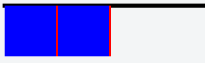
例如:
<div class="box">
  <div class="fl"></div>
  <div class="fl"></div>
</div>
<style>
.box {
  border: 4px solid black;
}
.fl {
  width: 100px;
  height: 100px;
  background-color: blue;
  border-right: 4px solid red;
  float: left;
}
</style>
效果如下图:
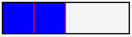
此时,触发父元素的BFC,由于上述行为5:BFC计算高度时会包含其中的浮动元素,父元素的高度会包含两个浮动的子元素,高度即被“撑开”了,代码如下:
<div class="box">
  <div class="fl"></div>
  <div class="fl"></div>
</div>
<style>
.box {
  border: 4px solid black;
  overflow: hidden; /*触发BFC*/
}
.fl {
  width: 100px;
  height: 100px;
  background-color: blue;
  border-right: 4px solid red;
  float: left;
}
</style>
效果如下图:
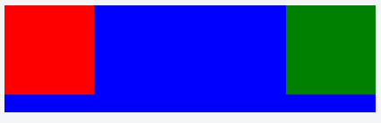
左右定宽,中间自适应布局
下面这段代码:
<div class="left float-box"></div>
<div class="right float-box"></div>
<div class="mid"></div>
<style>
.float-box {
  width: 100px;
  height: 100px;
}
.left {
  background-color: red;
  float: left;
}
.right {
  background-color: green;
  float: right;
}
.mid {
  height: 120px;
  background-color: blue;
}
</style>
根据行为3,会产生以下效果:
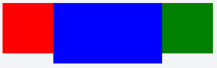
如果触发中间box的BFC,比如做以下设置:
.mid {
  height: 120px;
  background-color: blue;
  overflow: hidden;
}
根据行为4,会产生以下效果:
解决外边距折叠
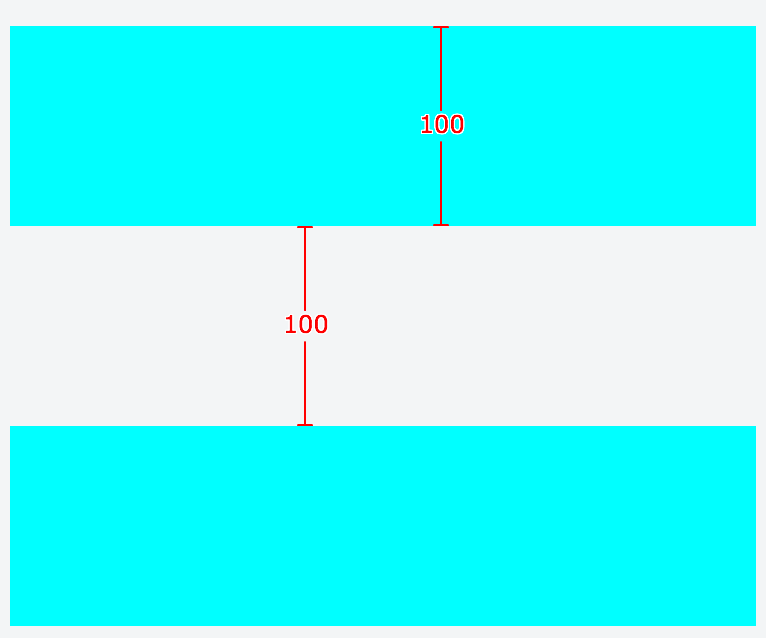
同一个BFC中,毗邻的块级盒子之间垂直方向的
margin会合并
例如以下代码:
<div class="box"></div>
<div class="box"></div>
<style>
.box {
  height: 100px;
  margin: 100px 0;
  background-color: cyan;
}
</style>
产生了如下效果:
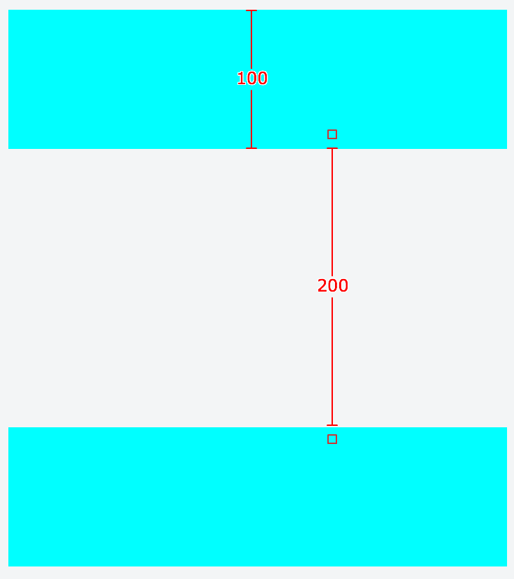
此时,如果把其中一个.box用一个BFC包裹起来,或者干脆把两个.box分别用BFC包裹起来,则可避免外边距折叠,代码如下:
<div class="box"></div>
<div class="wrapper">
  <div class="box"></div>
</div>
<style>
.wrapper {
  overflow: hidden;/*触发BFC*/
}
.box {
  height: 100px;
  margin: 100px 0;
  background-color: cyan;
}
</style>
效果如下:
总结
BFC就是页面上一个独立容器,其中的子元素的布局不会影响到其外部元素,外部元素的布局也不会影响到BFC内部的元素
- 当BFC中的元素存在浮动时,为了不影响BFC外部元素的布局,BFC计算高度时会把浮动子元素的高度计算在内
- 当BFC外部兄弟元素存在浮动时,为了不影响BFC内部元素的布局,BFC会通过变窄而不与浮动元素重叠
- 当BFC内部元素的第一个或最后一个块级元素存在上下
margin时,BFC的边沿会正确与子元素产生相应的距离,而避免子元素与外部元素产生外边距折叠
参考文章:
- http://www.cnblogs.com/lhb25/p/inside-block-formatting-ontext.html
- https://www.w3.org/TR/CSS21/visuren.html#block-formatting
END